

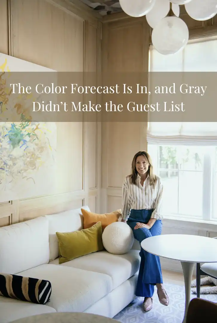
For a while, it felt like we all agreed on what a beautiful home was supposed to look like. White walls, gray furniture, neutral rugs and just enough beige to make everything feel warm—but not too warm! The goal was simple: create the perfect blank canvas where everything matched. Nothing clashed, nothing surprised you and, most importantly, nothing was too personal. But lately, that perfectly coordinated look has started to feel a little less interesting.
Maybe we are tired of our homes looking like they could belong to anyone. Maybe after years of spending more time at home, we want our spaces to actually reflect the people living in them. Or maybe we simply miss color! Whatever the reason, the design world is moving toward something warmer, calmer and much more individual. Benjamin Moore’s 2027 Color Trends palette is the perfect example. Its colors are earthy, slightly moody and inspired by shades that feel familiar rather than futuristic. There are soft blues, warm tans, dusty pinks, deep browns and, of course, green. Lots of green.
Benjamin Moore named Webster Green its 2027 Color of the Year, a rich, composed green that feels connected to nature without becoming the bright botanical moment you might be imagining. And that choice says a lot about where interiors seem to be heading. Across 2027 color forecasts, greens, earthy browns, softened blues and other easy-to-live-with shades are appearing again and again. The common thread is not simply color for color’s sake. It is a desire for homes that feel grounded, comfortable and personal.
I think that is what makes this palette so interesting. We are not necessarily moving from one trend into another. We are moving away from the idea that every room needs to follow the same formula. A home can have a green study, a pale blue kitchen and a warm, golden dining room without looking confused. In fact, that collected feeling is becoming part of the appeal. The rooms do not need to match perfectly because they belong to the same person.
And what colors are actually having their moment? Green is clearly leading the conversation, particularly deeper, earthier shades like Webster Green and olive tones such as Durango. These colors bring the outdoors inside while still feeling sophisticated enough for traditional and contemporary homes alike. Soft, watery blues are also appearing as a calmer alternative to the cool grays we have seen everywhere for years. Then there are the warmer shades: golden tans, coppery browns and deep burgundy. Benjamin Moore’s palette includes all of them, creating a collection that feels less like a perfectly coordinated showroom and more like colors you might naturally encounter in the world around you.
That connection to nature might be one of the biggest shifts happening in our homes. For years, many interiors were designed around creating a clean, neutral canvas. Now, people seem more interested in creating a place that feels calming. Green reminds us of gardens and trees. Blue can bring to mind water and open skies. Browns, copper and warm tans feel grounded and earthy. Even when these colors are used in a sophisticated way, they bring a little bit of the outside world indoors.
This is particularly interesting in Houston, where our homes can have such dramatically different personalities. A traditional River Oaks or Southampton home might embrace Webster Green in a library or on custom millwork, while a contemporary home in Montrose could use the same color to add warmth to a cleaner, more modern space. In Tanglewood or Memorial, warmer tones can soften large rooms and newer construction without making them feel overly traditional. The beauty of these colors is that they do not require every home to look alike. They can adapt to the architecture and personality already there.
And perhaps that is what I like most about the 2027 palette. It gives homeowners permission to have an opinion. Your dining room does not need to be the same shade as your neighbor’s. Your living room does not need to photograph like a furniture catalog. You can choose a color because it reminds you of somewhere you love, because it works beautifully with your grandmother’s antique table or simply because it makes you happy when you walk into the room.
Of course, trends will always change. In a few years, we will probably look back and laugh at something we are currently convinced is timeless! But the larger shift toward warmer, more personal homes feels different. Benjamin Moore’s 2027 palette is rooted in colors with a sense of history and staying power, while still encouraging homeowners to make a space their own.
So, gray, we appreciate everything you did for us. You were safe. You were reliable. You matched with absolutely everything. But our homes are ready for a little more personality. And frankly, I think that is something worth celebrating.
Until next time,
Dee Dee Guggenheim Howes
Source: https://www.elledecor.com/design-decorate/color/a74112064/benjamin-moore-2027-color-trends-palette/